
Have you ever approved a T-shirt design that looked vibrant on a computer screen, only to see the finished shirt look dull, faded, or completely different?
It happens more often than many customers realize—especially on dark-colored garments.
Imagine a black shirt with a bright neon logo. The digital proof looks bold and eye-catching. But when the shirt arrives, the colors seem muted and lack the punch you expected. Or maybe you ordered a soft pastel design on a navy hoodie, only to discover the artwork practically disappears from a few feet away.
In many cases, the difference comes down to one critical factor: screen printing white ink.
Understanding how white ink works can help you avoid disappointing results and create designs that look sharp, vibrant, and professional.
Why White Ink Matters More Than Most People Think
When printing on dark garments, printers often face a simple challenge: fabric color affects ink appearance.
Unlike a computer screen that produces light, printed ink sits directly on the fabric surface. If bright colors are printed directly onto a black or dark-colored shirt, the fabric underneath can show through and reduce visibility.
That’s where screen printing white ink becomes important.
White ink is commonly used because it provides:
- Better opacity
- Stronger color visibility
- Improved print quality
- More consistent color reproduction
Opacity simply means how well an ink blocks the color beneath it. Higher opacity allows printed colors to appear brighter and closer to the intended design.
Without sufficient coverage, reds may look muddy, yellows can appear weak, and neon colors may lose much of their impact.
What a Successful Print Looks Like
Designers and customers should think about how artwork will interact with the shirt color.
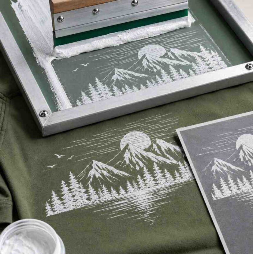
For example, if you’re printing a neon green logo on a black T-shirt, the printer may first apply a white underbase. An underbase is a layer of white ink printed beneath the colored artwork. Think of it as a clean canvas that helps colors stay bright.
After the underbase is applied, the design colors are printed on top.
Some jobs may also use a highlight layer or top color layer to improve brightness and detail.
Artwork preparation also plays a major role. Clean edges, proper color separation, and well-defined layers help printers achieve better results.
When artwork is prepared correctly, colors appear more vibrant, fine details remain visible, and the finished product looks closer to the original proof.
What Can Break a Design?
While white ink can improve a print dramatically, several common issues can create disappointing results.
Under-Coverage
One of the biggest problems is insufficient ink coverage.
If the white layer is too thin, dark fabric can influence the final color appearance.
For instance, a bright orange graphic on a black shirt may end up looking brownish or faded because the shirt color shows through.
Using the Wrong Ink
Not all white inks perform the same way.
Different garment types and design requirements may call for different ink formulations.
Choosing an inappropriate ink can affect brightness, durability, and overall appearance.
Improper Curing
Curing refers to the process of heating ink so it properly bonds to the fabric.
If ink isn’t cured correctly, several issues may occur:
- Reduced durability
- Premature cracking
- Fading after washing
- Poor adhesion
Proper curing helps ensure the print remains stable through normal wear and laundering.
Poor Color Separation
Color separation is the process of preparing artwork layers for printing.
If separations aren’t handled correctly, colors may overlap poorly, lose detail, or appear inconsistent.
This is especially important when multiple colors are being printed over a white underbase.
Transparency Problems in Artwork
Digital artwork sometimes contains transparency effects, gradients, or blending modes that don’t translate perfectly to screen printing.
A design that looks great on a monitor may require adjustment before printing.
For example, a subtle fade effect on a dark shirt may become difficult to reproduce accurately using traditional screen printing techniques.
Unrealistic Expectations
Some designs simply push the limits of the printing process.
A light pastel graphic on a charcoal shirt may never appear exactly as bright as it does on a white background.
Similarly, highly detailed photo effects may require alternative decoration methods or artwork modifications.
Understanding these limitations early helps prevent surprises later.
A Quick Checklist Before Approving a Proof
Before giving final approval, ask yourself these questions:
✔ Is the garment color dark enough to require a white underbase?
✔ Have bright colors been tested against the chosen fabric color?
✔ Does the proof clearly show how colors will appear on the actual garment?
✔ Are gradients or transparency effects necessary for the design?
✔ Has the printer explained any limitations related to opacity?
✔ Has curing and durability been considered for the fabric type?
A few extra questions upfront can save time, money, and frustration.
Final Thoughts
A great design doesn’t depend solely on the artwork itself. The way that artwork is printed can dramatically affect the final result.
When screen printing white ink is planned correctly, colors appear brighter, details remain clear, and designs stand out the way customers expect. When it’s overlooked or handled poorly, even excellent artwork can lose its impact.
Whether you’re ordering shirts for a brand, event, or merchandise line, understanding concepts like opacity, underbase layers, garment color, and curing can help you make better decisions. By reviewing proofs carefully and discussing expectations with your printer, you’ll be far more likely to receive prints that match your vision and deliver consistent results.
Quick FAQ
Do I always need white ink?
No. Light-colored garments often don’t require white ink underneath the design. Dark garments usually benefit from it.
Will white ink crack?
It can over time if the print experiences heavy wear or if curing wasn’t done properly. Proper production practices help reduce the risk.
How many passes of white ink are needed?
It depends on the garment color, artwork, and desired brightness. Some jobs require a single pass, while others may need additional coverage.
Can white ink print on any fabric?
White ink works on many fabrics, but results can vary depending on material type, fabric texture, and garment construction.